Sometimes, cities wear their identity on their sleeves, but for the Chicago White Sox, it’s stitched into their jerseys. When the news first became public, it looked like a streetwear collaboration announcement instead of a sports uniform reveal. Hype buzzed; assumptions ballooned, and fans braced for something vital.
However, the moment the pictures hit the internet, the reviews came like a fireworks factory on fire. What was assumed to be a proud mix of two iconic identities quickly became the latest meme template, and just like that, MLB fans had their newest target.
The highlight came with the basic pomp: dramatic lighting, bold color choices, and buzzwords flying around as fast as a Tim Anderson fastball. “JUST IN: The White Sox have revealed their Bulls-inspired City Connect uniforms,” MLB’s official account posted — and that is when things spiraled. Quickly, social media were flooded with one-liners.
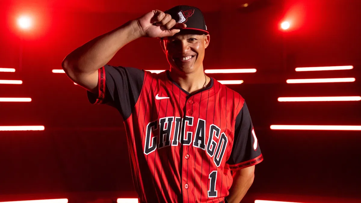
So, what actually happened? Will Venable’s team, in cooperation with multiple MNCs like Nike, Fanatics, New Era and the NBA’s Bulls, launched a City Connect uniform. It was supposed to pay homage to Chicago’s rich sports culture. The jersey contains bold black-and-red pinstripes, nods to six Bulls titles and three championships of the team. However, the plot twist comes with two distinctive caps. It is flashy, layered and ambitious. Perhaps, too ambitious?
JUST IN: The White Sox have revealed their Bulls-inspired City Connect uniforms pic.twitter.com/QEl8s91SLK
— MLB (@MLB) April 28, 2025
Time to rewind to the intention. The team’s Chief Revenue and Marketing Officer, Brooks Boyer, said, “One of the challenges we had coming out of having our first Southside City Connect jersey was how could you ever match it or top it… no one has ever done a collaboration between a Major League Baseball team and an NBA team, ” (Fair). That was a cultural grand slam. However, it focuses on something that attempts to balance two legacies. That is walking a tightrope with cleats on.
To highlight, Boyer worked cooperatively with top MNCs to ensure a fresh and meaningful design. “We were looking at what made the uniform… it was really hard to pick between these two, and that’s why they came up with the option of having two,” Boyer added. A cap highlights the Bulls, another leans Sox — and inside? Easter eggs, with jersey aspects from the teams with a “Southside” rim tag.
However, when you are swinging for legend status, you better hit. Rather, fans identified something that looked like a court instead of a diamond. The words “Chicago Bred” boldly felt like a sneaker drop line, not a baseball branding. In addition, while the dual-cap thought is ambitious, it left multiple fans questioning why divide the identity?
The intent was legacy. The outcome: multiple jokes. Fans did not just dislike it — they felt disconnected. In addition, that is the kind of strikeout which goes beyond fashion — it hits the culture.
White Sox fans’ reactions erupt as Bulls-inspired sparks firestorm
When the red-dominant Bulls-themed shape was first identified by White Sox fans, some quickly provided their concern about the identity crisis. One fan said, “So they are the Red Sox now?” While the thought was to fuse Chicago sports history, the overwhelming red made it tough to tell whether this was a White Sox or a Red Sox tribute. However, the irony was that the team had never been linked with red as a bold color. Instead, their signature colour has been black, white, and silver.
That confusion only grew with another reaction: “They should change their name to the Red Sox… am I right”? Such a sarcastic jab played off the visual deception. However, honestly, it is not just them being petty — when you drop a City Connect jersey which highlights your competitor’s identity, backlash is inevitable. The two teams are tough competitors. In addition, the 2025 season for the White Sox is not going well, with a 7-21 record, specifically, compared to the Red Sox’s 16-14 record. Fans are already frustrated with this, and the red flash mistake is just adding fuel to the discomfort.
The backlash did not stop at colors — it went deeper. A frustrated fan said, “Such a dope idea for an *** team, what a shame.” The link in this review lies in performance. The team’s record places the White Sox at the bottom of the AL standings. They are trailing the Tigers by 11 games and the Twins by 5 games. In addition, their early-season issues have led to projections of a record of 41-121. Dropping a flashy jersey during a dismal season felt tone-deaf.
That feeling continued with another pointed reaction: “LMAOOO WHITE SOX THINK WEARING THE BULLS COLORS IS GONNA MAKE THEM PLAY LIKE MJ ERA BULLS.” Tough to digest. The Bulls of the ’90s were the face of dominance. This team in 2024 and 2025? The worst. Dressing like champions does not mask the on-field chaos, and fans will not forget this.
Still, not all fans brought the pitchforks. A surprising reaction came from a fan: “This is an excellent idea, and whoever thought of it deserves a raise. From a Brewers fan.” Sometimes, an outsider appreciates risky moves more than the home fan. It is true — conceptually, an NBA-MLB collaboration is creative. In addition, the Chicago market has effectively adopted this. However, while the thought could be new, its reception proves that execution matters most. It would not be a headline if the team could execute as creatively on the field.
A vital crossover, a tough season and a barrage of reactions — the White Sox City Connect launch had it all. However, fan reactions make one aspect clear: the flashiest jersey cannot always mask poor performance.
The post White Sox Mercilessly Trolled as Yet Another MLB Jersey Fails to Impress Fans appeared first on EssentiallySports.