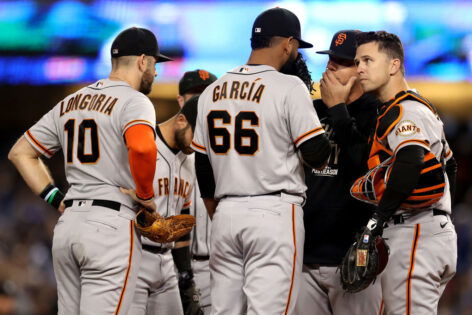
For a franchise that prides itself on tradition, the San Francisco Giants just can’t seem to get their jerseys right. After retiring their widely disliked City Connect uniforms following the 2024 season, fans hoped Nike and the team would deliver something more in line with the club’s rich history. Instead, they got… this. The newly leaked Giants jerseys have sent the fanbase into an uproar, and the reaction is brutal. Social media is flooded with memes, comparisons to safety cones, and outright disbelief that this was the best Nike could come up with.
It’s not just a matter of taste—it’s a trend. Across Major League Baseball, Nike’s recent uniform redesigns have been met with skepticism and, in some cases, outright rejection. Fans love a fresh look, but they also want something that respects a team’s legacy. Unfortunately, the Giants’ new design seems to have abandoned tradition altogether in favor of a modern experiment gone terribly wrong. And fans are not holding back.
When the leaked images of the new 2025 jerseys hit social media, the response was swift and merciless.
The new design features an eye-popping creamsicle-orange color with a bizarre, modernized “G” logo that looks more like a corporate rebrand than a baseball classic. The gradient effect—again—makes an unwelcome return, this time in an even more jarring fashion.
The new San Francisco Giants Nike City Connect jerseys have apparently leaked
(via @BayAreaBryy) pic.twitter.com/0mWG23ppCL
— Talkin’ Baseball (@TalkinBaseball_) March 26, 2025
Within minutes of the leak, Giants fans flooded Twitter (X) with memes and ruthless commentary. One user compared the design to a “bottle of Glacier Freeze Gatorade,” while another quipped that it looked like a “blinding traffic cone.” Others mocked Nike’s continued obsession with gradient designs, saying, “Did they learn nothing from the last disaster?”
This isn’t the first time Nike has come under fire for its MLB designs. The 2024 season saw players from multiple teams, including the Yankees and Dodgers, complaining about the quality of their jerseys—thin material, awkward fits, and in some cases, completely off-brand aesthetics. With the Giants’ latest uniform debacle, it seems Nike is once again prioritizing bold (and baffling) design choices over what fans actually want.
The backlash is loud, but will the Giants take action? Given how poorly the previous City Connect jerseys were received, there’s a chance the team rethinks its approach before an official release. But if recent history is any indication, Nike won’t be making any major course corrections.
For now, Giants fans are left to hope that maybe, just maybe, the team will realize that baseball jerseys aren’t supposed to look like rejected tech company branding. If not, they might just have to squint through the 2025 season—literally.
Instant backlash: Giants fans reject the new design
Fans ripped into the Giants’ new Nike uniforms, mocking the design as a sign that the franchise has lost its sense of tradition. Sarcasm ran wild as some questioned whether the team even takes itself seriously anymore, while dismissing the jerseys as an outright disaster. The overwhelming negativity suggests deep frustration, especially after the team’s previous City Connect failure. Instead of excitement, the new design sparked disbelief, with critics slamming Nike for once again prioritizing experimental aesthetics over a look that truly represents the Giants’ identity.
The Giants used to be a serious franchise
These are so so so so bad.
— Jawns_WaterIce (@SandlotSox) March 26, 2025
Nike’s latest Giants uniform design has fans questioning whether it was meant for a baseball team or a kids’ TV special. The bold colors and unconventional look led some to compare it to a Nickelodeon-inspired gimmick rather than a serious redesign. The reference to “Splash HRs” ties into McCovey Cove, suggesting that instead of honoring San Francisco’s baseball culture, the jerseys resemble a promotional stunt. Critics see this as another example of Nike prioritizing flashy aesthetics over a meaningful connection to the team’s identity, leaving many fans unimpressed.
Was this designed by Nickelodeon for the Splash HR’s?
— Skyline619 (@robby619SD) March 26, 2025
Others wasted no time ridiculing the Giants’ new Nike uniforms, with some comparing them to something designed by kids in a Sunday little league. The bright colors, awkward gradients, and playful aesthetic make the jerseys feel more like a youth team’s experiment than a professional baseball uniform. Instead of embracing the franchise’s historic look, the design comes across as amateurish, lacking the sophistication expected from an MLB team.
Looks like the let the Sunday little league kids design their own uniforms
— Pearson (@jaypwinner) March 26, 2025
Some fans are declaring Nike’s latest Giants uniforms the worst in recent memory. Even the Mets’ infamous pullover jerseys, long criticized for their questionable design, now seem tolerable by comparison. The new Giants’ look has pushed uniform aesthetics to what many believe is rock bottom, with fans slamming the design as uninspired and gimmicky. Instead of a fresh take on tradition, the jerseys have been met with widespread disappointment, reinforcing frustration over Nike’s recent MLB uniform trends.
I didn’t think it can get worse than the Mets pull over jerseys. It has officially hit rock bottom.
— Mike Oxlong (@Yankees_Lut) March 26, 2025
The harsh criticism of the Giants’ leaked Nike uniforms has led to some brutally creative reactions, with fans comparing the design to an unfortunate accident rather than a bold fashion statement. The choice of words suggests not only a lack of enthusiasm but outright disgust, emphasizing just how poorly received the jerseys have been. Rather than excitement over a fresh look, the leak has only fueled anger, reinforcing the belief that Nike has completely missed the mark. Fans were already skeptical of recent MLB uniform trends, but for many, this latest design represents an all-time low.
Appropriate they’d leak. Diarrhea usually does.
— ๖ℓนҽค℘℘ℓᏋ𝖘 (@ashesofacacia) March 26, 2025
The Giants once had one of the most well-received City Connect jerseys in MLB, but their latest design has completely flipped the script. What was once a standout example of how to modernize a team’s look has now turned into a cautionary tale of what not to do. Fans who once praised the team’s bold yet tasteful approach are now left wondering how things went so wrong. The overwhelming response suggests that instead of building on past success, Nike’s latest attempt has taken a dramatic turn for the worse, leaving many to declare it one of the worst uniforms the franchise has ever worn.
From one of the best City Connect to one of the worst.
— Ken Pittman (@BuckeyeKen24) March 26, 2025
At last, instead of honoring the team’s history or pushing a fresh but respectful design, Nike’s latest attempt feels like a complete misfire. With the backlash growing louder by the hour, the real question is: Will the Giants actually listen to their fans, or are they stuck with one of the most disliked jerseys in franchise history?
The post “Worst Jerseys” – Giants’ New Nike Uniforms Face Brutal Fan Backlash as Franchise Gets Relentlessly Mocked appeared first on EssentiallySports.